Putting the macho in wedding organizing
ETEREA Weddings
A wedding is a once-in-a-lifetime moment. Every detail has to be accounted for so that everything is perfect and all the good memories last forever. Most wedding organizers nowadays have identities that are feminine in its nature. The problem is, sometimes, a masculine approach is deemed more dependable and trustworthy.
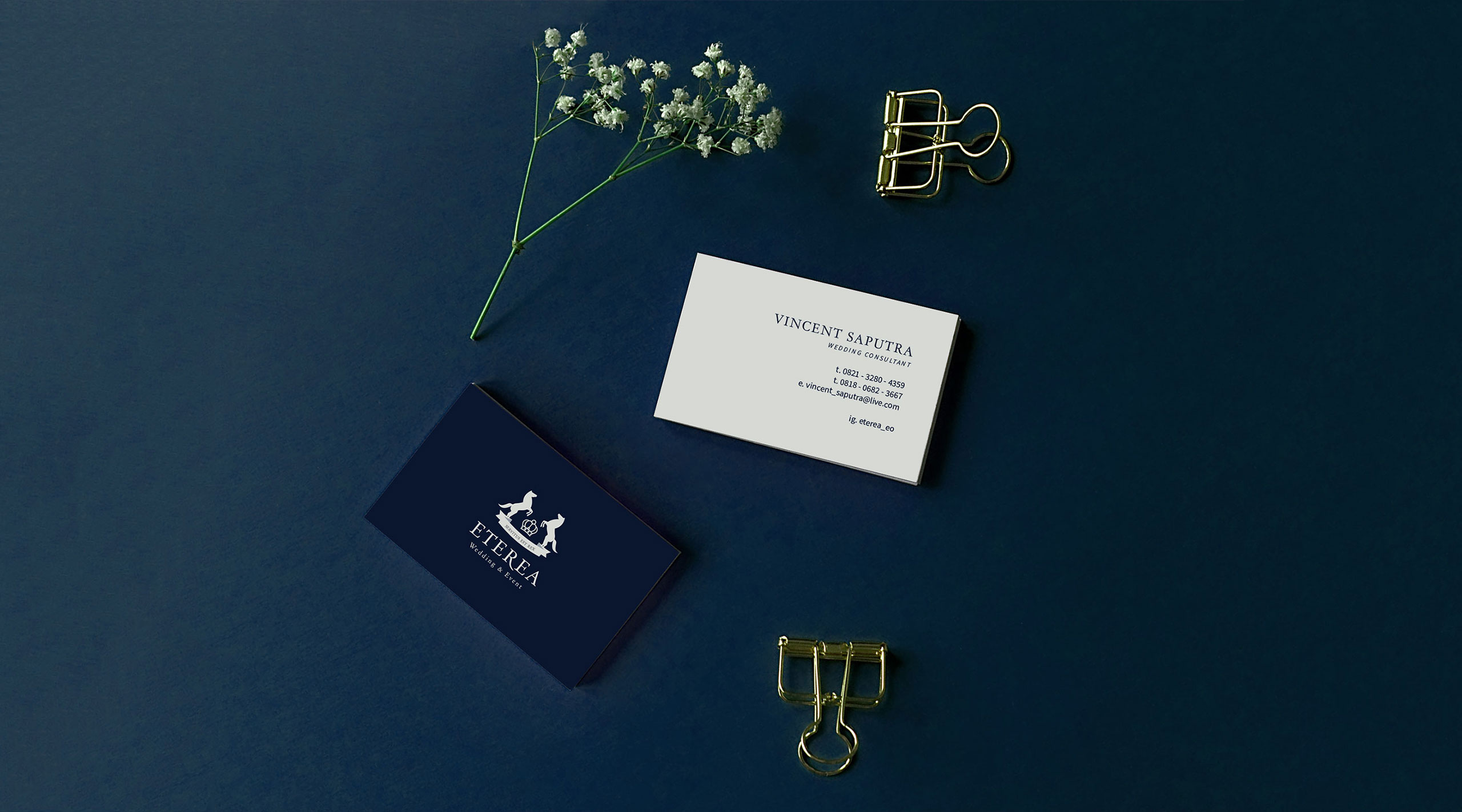
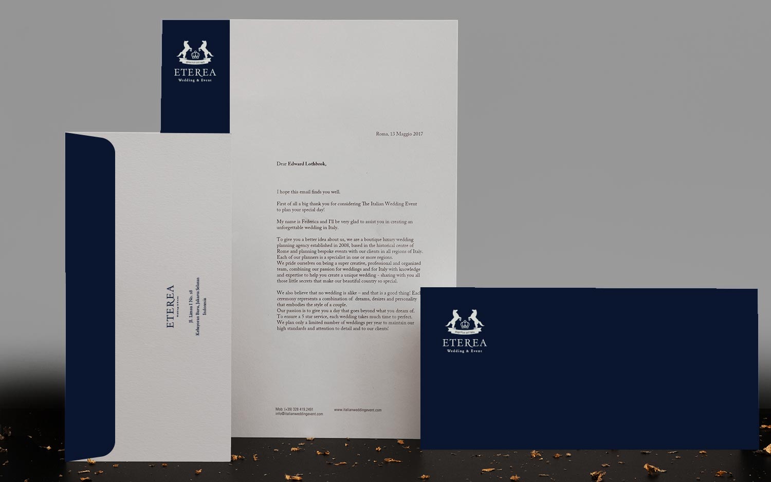
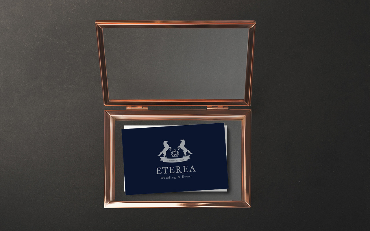
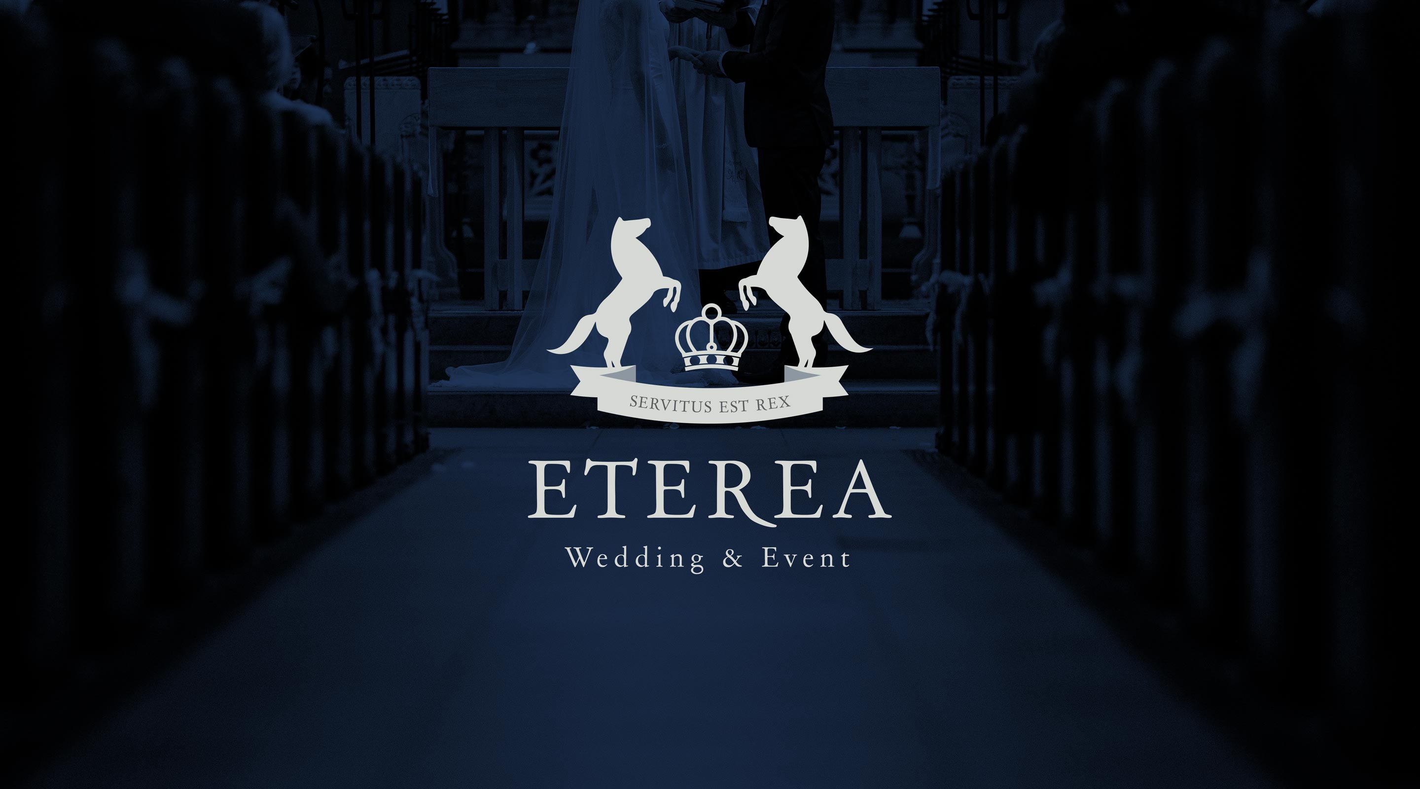
Taking on the story of faithful, dedicated butlers, ETEREA Weddings wanted to convey a sense of “grandiose humility” towards its customers with a custom insignia as its logogram. Horses are servants, and yet, many legendary steeds are written as a faithful partner in battle in epochs of ancient times. The color dark blue is utilized to further convey trustworthiness.
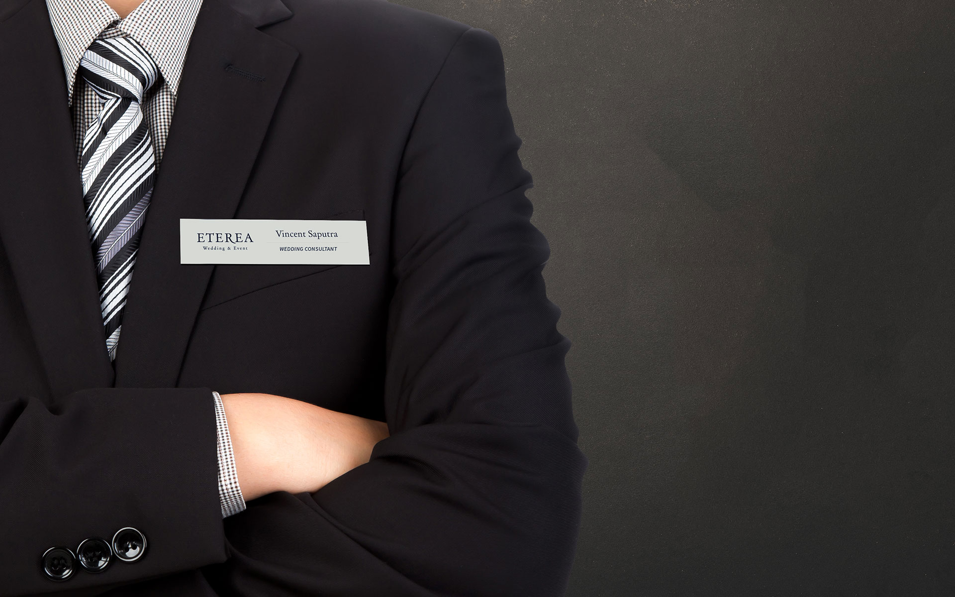
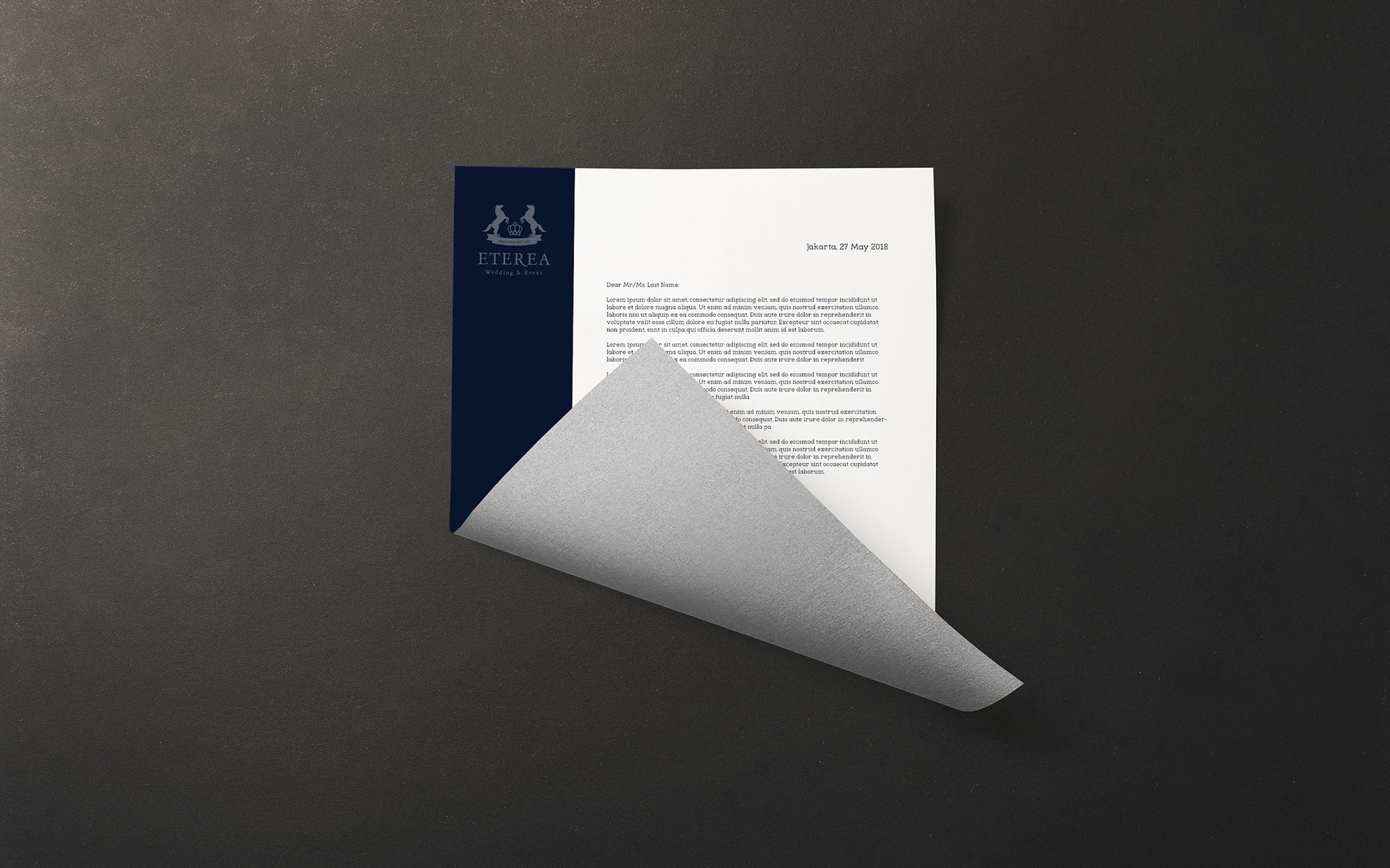
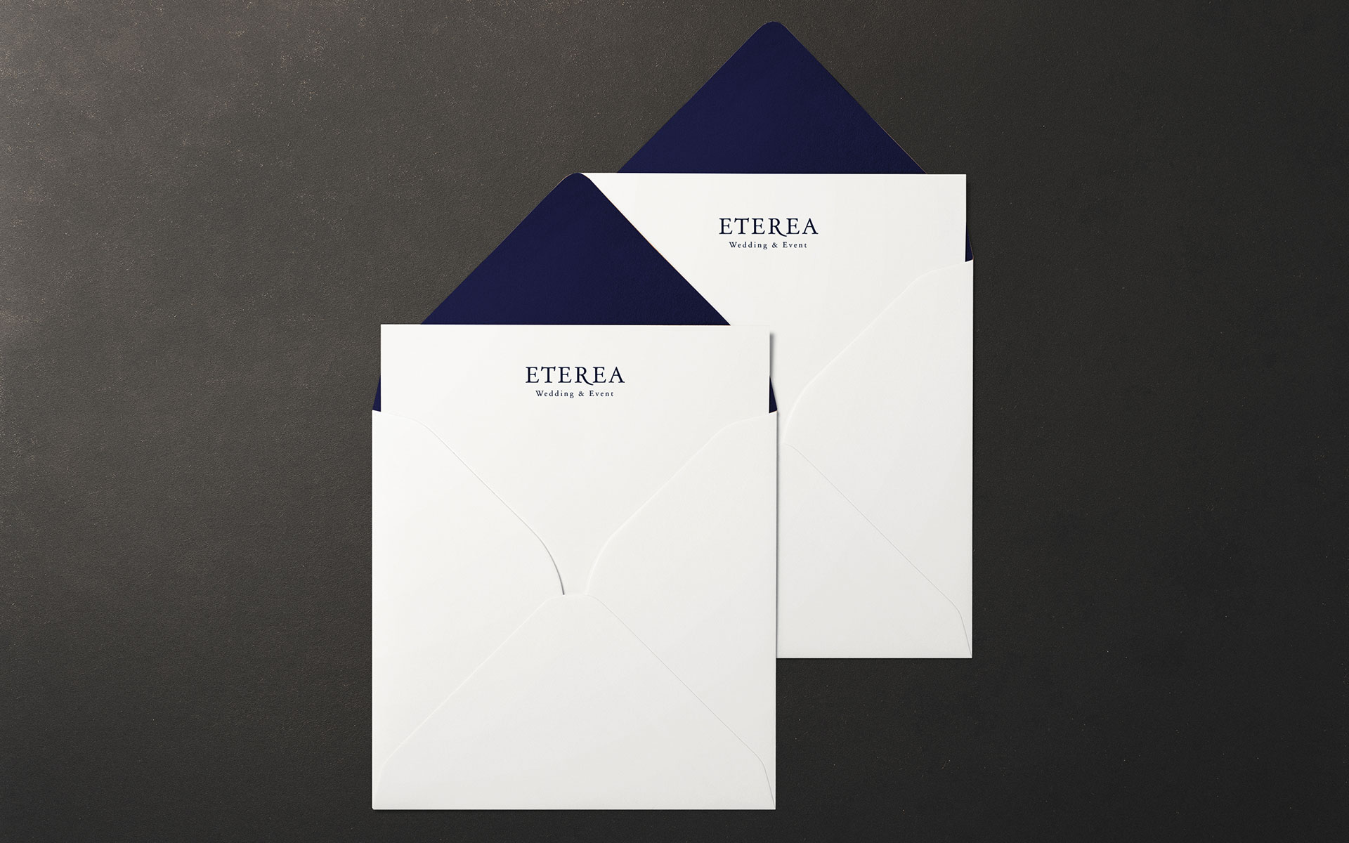
The logo is designed to be used in a couple of ways: just the logotype without the emblem, the emblem only, and both of them combined. All the collaterals have a foil finish so that the grey turns into silver and the brand identity gets a little bit of bling. Silver is always second to gold, that is why said color is used instead of gold to convey a strategic message: we will not overbear the golden moment of marriage.